iTemblor
The inspiration, approach and features of the iTemblor app are presented, now one of the oldest apps on the app store.
iTemblor was first published in the nascent Apple app store back in 2009. It's been on the store ever since.
The original motivation was to learn more about the iPhone's onboard accelerometer and to see if it could be used in a simple seismological application that would be both playful and educational.
Originally written in Objective-C, in 2020 iTemblor was rewritten using SwiftUI.
Producing almost any app has at least one challenge (and usually more). In the case of iTemblor one challenge was properly synchronizing the writing and reading of the acceleration data, which occurs at very high rates. Fortunately, iOS provides excellent tools to handle this.
Balancing the various parameters to obtain a good visual experience was another challenge and certainly the current experience could be improved further. It's a matter of trial and error and time invested.
The Data
The nuts and bolts of the current data processing configuration are the following:
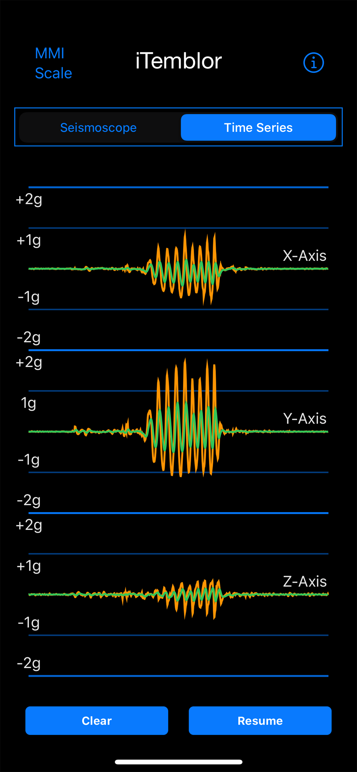
- The instantaneous acceleration data is obtained from the accelerometer at a frequency of 100 hertz or every 0.01 seconds
- The length of the time series is chosen to be 1024 points, which translates to 10.24 seconds of data at any given time
- The time series is (re)plotted at a refresh rate of 20 hertz or 0.05 seconds
Plotting The Data
As mentioned the instantaneous data is plotted every 0.05 seconds. This value represents a balance between arrival of new data and the time required to read, process and plot the data. If we refresh much more slowly the result is a jittery plot with missing data, much faster and the entire data processing pipeline becomes blocked up waiting on itself.
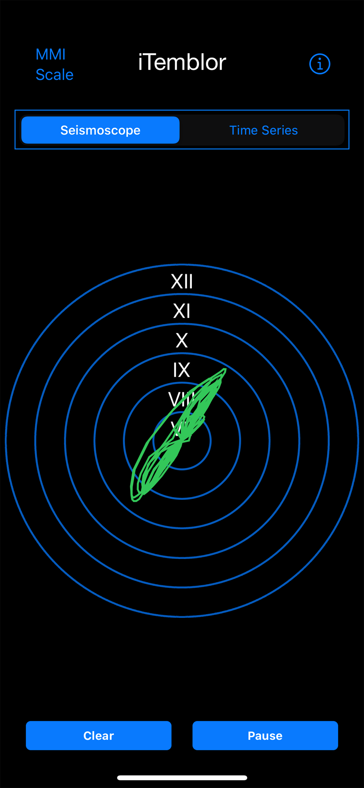
In the case of the Time Series View the 3 component acceleration data (x, y and z) is plotted in a continuous fashion as a percentage of gravity (g) with time moving from right to left. The orange time series represents the pure acceleration signal with the effect of gravity removed. The green time series is further processed by high pass filtering the data to 10 hertz to remove higher frequency spikes as one shakes or taps the phone.
It's the green time series that we also use in the Seismoscope View where the x and y components of acceleration are used to determine the direction of motion in the horizontal 2D plane (this is why you need to hold the phone flat to properly use this view). The x and y components are then used in combination to calculate the corresponding MMI value from an empirical relationship between horizontal Peak Ground Acceleration (PGA) and MMI (see Gutenberg & Richter (1942; 1956) and Elementary Seismology - Richter (1958)). All MMI values between VI and XII are then (re)plotted at the stated refresh interval.
A final comment relates back to the 10 hertz high pass filter and the empirical Richter PGA - MMI relationship. Most of the energy produced by large earthquakes, especially those that produce MMI >= 6, propagates at frequencies less than 10 hertz (typically much less) and is recorded by seismometers sensitive to this spectrum. Therefore, we need to filter out the high frequency spikes from our accelerometer data to attempt to align this data best as possible with the data used in the empirically derived relationships.
Please note: Earthquakes are very complex and variable processes, therefore, the iTemblor app should be viewed as approximate at best and be used for educational and entertainment purposes only.